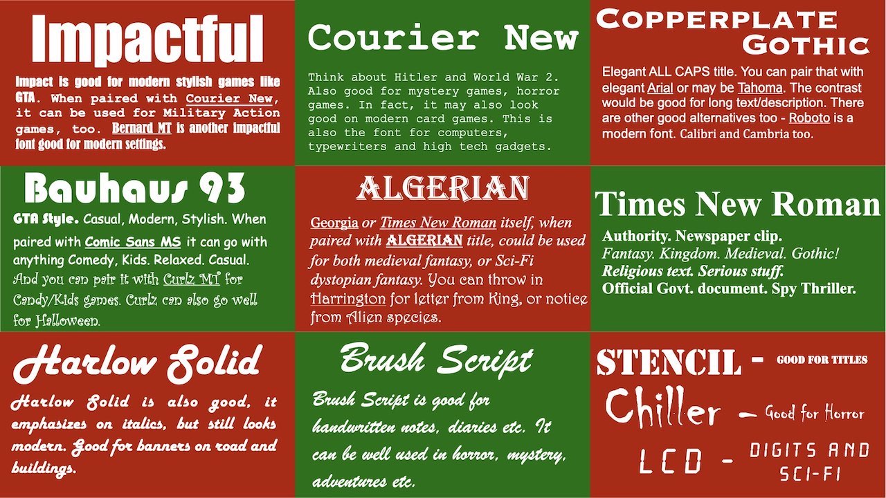
How to make good UI by using common but beautiful fonts
RTS Assets Collection » Devlog
It is very important to have a consistent look and feel when designing your game. Fonts play an important role there.
If you want to distribute your game or windows, or on multiple platforms, if you choose a font that is common and available on all of those platforms, it will look smooth.
Take a look.

| Type of Game | Font for Titles and Banners | Font for Text |
| Casual, Cards, Strategy | Group 1 - Roboto, Segoe UI Group 2 - Cambria, Times New Roman | Group 1 - Roboto, Calibri, Arial Group 2 - Cambria, Times New Roman |
| Kids, Funny, Soft | Group 1 - Bauhaus93 Group 2 - Curlz MT | Comic Sans MS |
| Serious, Stylish, Military, Futuristic | Agency FB LCD Copperplate Gothic | Agency FB Courier New Consolas |
| Medieval, Victorian, Steampunk | Bernard MT Harlow Solid | Group 1 - Harrington, Times New Roman, Georgia Group 2 - Segoe Script, Brush Script MT |
| Modern | Impact Copperplate Gothic | Courier New Consolas Agency FB LCD |
| Horrror | Chiller Curlz MT | Courier New Harrington Brush Script MT |
- Chose one font from each group and combine with other.
- Arial will go almost anywhere where you have heavy text. Like settings, description, etc. Arial is more common, but Roboto or Calibri may look more elegant.
Files
Fonts.zip 14 MB
Oct 14, 2023
Cards.zip 4.9 MB
Oct 14, 2023
Characters.zip 10 MB
Oct 14, 2023
SpecialEffects.zip 24 MB
Oct 14, 2023
TilesAndMaps.zip 816 kB
Oct 14, 2023
SoundEffects.zip 4.3 MB
Oct 14, 2023
Get RTS Assets Collection
RTS Assets Collection
A very big collection of Real Time Strategy assets
| Status | In development |
| Category | Assets |
| Author | Jose Enson |